Introduction
Hello Guys, in this article you are going to know the 5 CSS properties and features you need to master, once you master these features I assure you that you can be able to build any UI design that comes your way, from basic to advance designs.
Prerequisites
This article is for total beginners and for intermediate-level developers that want to sharpen their skills in CSS.
What you will learn
- What is CSS
- Margin and Padding
- Use case
- Helpful resources
- Positioning
- Types of Positioning
- Helpful resources
- Flexbox?
- Features of flexbox
- Flexbox properties
- CSS Grid
- Helpful resources
- Media Queries
- Helpful resources
What is CSS?
CSS stands for Cascading Style Sheet, and it is simply used to style web pages. CSS has over 259 properties used for styling and in all these large numbers of properties, there are few that are used on a daily bases, and without them, we can't build a standard design.
These few CSS properties are:
- Margin & Padding
- Positioning
- Flexbox
- Grid
- Media Queries
Margin & Padding
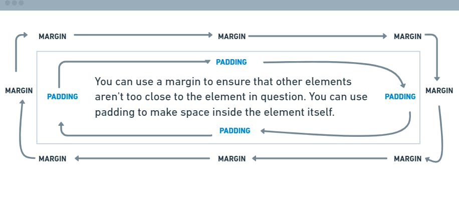
Understanding how margin and padding work is very simple and important. Margin is the space around all HTML elements, While Padding is the space inside the HTML elements.
Use cases
You can use a margin to ensure that other elements aren't too close to the element in question. You can use padding to make space inside the element itself.

Helpful rescourse
Margin and Padding Deep Dive: The basics
How CSS Padding and Margin Works
Positioning
Positioning an element is another important feature in CSS, positioning will help you achieve some cool design patterns when designing. The CSS position property defines the position of an HTML element in a document. This property works with the left, right, top, bottom, and z-index properties to determine the final position of an element on a page. Note that by default, the position property for all HTML elements in CSS is set to static. This means that if you don't specify any other position value or if the position property is not declared explicitly, it'll be static
Types of Positioning
- Position Relative
- Position Absolute
- Position Fixed
- Position Sticky
- Position Static
Helpful resources
CSS Position Tutorial | Learn CSS For Beginners
CSS Positioning: Position absolute and relative explained
Flexbox
The flexbox or flexible box model in CSS is another key feature to master, it is a layout model that provides an easy and clean way to arrange items within a container. Flexbox can be useful for creating small-scale layouts & is responsive and mobile-friendly.
Features of flexbox:
- A lot of flexibility is given.
- Arrangement & alignment of items.
- Proper spacing
- Order & Sequencing of items.
Flexbox properties:
- Display: flex
- Flex-direction: row | row-reverse | column | column-reverse
- align-self: flex-start | flex-end | center | baseline | stretch
- justify-content: start | center | space-between | space-around | space-evenly
Helpful resources
CSS Grid Layout
CSS Grid is similar to flexbox but is more geared toward complex layouts, it can be used to create any kind of layout, and it is more complex and difficult to master.
Helpful resources
Learn CSS Grid by Building 5 Layouts in 17 minutes
Media Queries
You can't build a modern website if you don't understand what and how media query works. Media queries are a key part of responsive web design, as they allow you to create different layouts depending on the size of the viewport, but they can also be used to detect other things about the environment your site is running on, for example, whether the user is using a touchscreen rather than a mouse.
Helpful resources
A Complete Guide to CSS Media Queries
Standard Resolutions, CSS Breakpoints, and Target Phone Sizes
Conclusion
If you can master those five CSS properties you can build any design that comes your way from your design team or your client. These properties come in handy in almost all standard projects you will come across. I hope you have found this article helpful.

